Apple Retina Viewport Cheat Sheet
Complete CSS logical viewport dimensions, hardware resolutions, DPR multipliers, and one-click CSS media queries for all modern Apple devices.
| Device Model | CSS Viewport (W × H) | Hardware Pixels | DPR | PPI | Developer Quick Actions |
|---|---|---|---|---|---|
| iPhone 16 Pro Max iPhone | 440 × 956 pt | 1320 × 2868 px | 3.0x | 460 PPI | |
| iPhone 16 Pro iPhone | 402 × 874 pt | 1206 × 2622 px | 3.0x | 460 PPI | |
| iPhone 16 / 15 / 15 Pro iPhone | 393 × 852 pt | 1179 × 2556 px | 3.0x | 460 PPI | |
| iPhone 15 Pro Max / 14 Pro Max iPhone | 430 × 932 pt | 1290 × 2796 px | 3.0x | 460 PPI | |
| iPhone 14 / 13 / 12 iPhone | 390 × 844 pt | 1170 × 2532 px | 3.0x | 460 PPI | |
| iPhone SE (3rd Gen) iPhone | 375 × 667 pt | 750 × 1334 px | 2.0x | 326 PPI | |
| iPad Pro 13" (M4) iPad | 1032 × 1376 pt | 2064 × 2752 px | 2.0x | 264 PPI | |
| iPad Pro 11" (M4) iPad | 832 × 1210 pt | 1664 × 2420 px | 2.0x | 264 PPI | |
| iPad Air 13" (M2) iPad | 1024 × 1366 pt | 2048 × 2732 px | 2.0x | 264 PPI | |
| iPad mini (6th Gen) iPad | 744 × 1133 pt | 1488 × 2266 px | 2.0x | 326 PPI | |
| MacBook Pro 16" (M3) MacBook | 1728 × 1117 pt | 3456 × 2234 px | 2.0x | 254 PPI | |
| MacBook Pro 14" (M3) MacBook | 1512 × 982 pt | 3024 × 1964 px | 2.0x | 254 PPI | |
| MacBook Air 15" (M3) MacBook | 1440 × 932 pt | 2880 × 1864 px | 2.0x | 224 PPI | |
| MacBook Air 13" (M3) MacBook | 1280 × 832 pt | 2560 × 1664 px | 2.0x | 224 PPI | |
| Apple Studio Display 27" Display & Vision | 2560 × 1440 pt | 5120 × 2880 px | 2.0x | 218 PPI | |
| Apple Pro Display XDR 32" Display & Vision | 3008 × 1692 pt | 6016 × 3384 px | 2.0x | 218 PPI | |
| Apple Vision Pro Display & Vision | 1280 × 1120 pt | 3660 × 3200 px | 2.8x | 3380 PPI |
What is Apple Retina Display & Device Pixel Ratio (DPR)?
An Apple Retina display is a high-density screen engineered so the human eye cannot discern individual pixels at normal viewing distances. It renders graphics using Device Pixel Ratios of 2.0x or 3.0x to map multiple hardware pixels to 1 logical CSS point.
Frequently Asked Questions
What is Apple Retina display scaling (@2x and @3x)? ↓
Apple Retina displays use hardware pixel doubling or tripling. A @2x screen renders 2x2 physical pixels per 1 CSS pixel (DPR 2.0). A @3x Super Retina OLED screen renders 3x3 physical pixels per 1 CSS pixel (DPR 3.0).
What is the CSS viewport size of iPhone 16 Pro Max? ↓
The iPhone 16 Pro Max has a physical resolution of 1320×2868 pixels, but its CSS logical viewport is 440×956 points at a Device Pixel Ratio (DPR) of 3.0 (460 PPI).
How do I target Retina displays in CSS media queries? ↓
To target @2x Retina screens in CSS, use: `@media (-webkit-min-device-pixel-ratio: 2), (min-resolution: 192dpi)`. To target @3x Super Retina screens, use `@media (-webkit-min-device-pixel-ratio: 3), (min-resolution: 288dpi)`.
What is the viewport resolution of MacBook Pro 14 and 16? ↓
The MacBook Pro 14 (M3) has a logical CSS viewport of 1512×982 (3024×1964 physical at 2x). The MacBook Pro 16 has a logical CSS viewport of 1728×1117 (3456×2234 physical at 2x).
Recommended Technical Guides
 5 min read
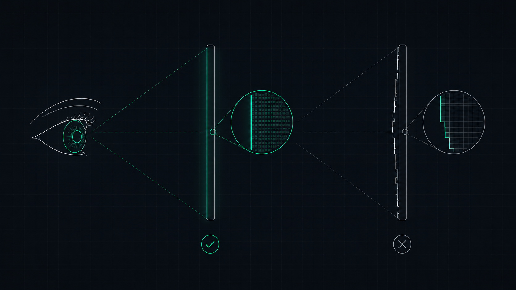
What is a Retina Display? Apple's Pixel Density Standard Explained
Apple's Retina display is a screen where pixels are so dense that the human eye cannot distinguish individual pixels at a normal viewing distance. Learn what makes a display Retina, what PPI qualifies, and how to check if your screen is Retina-quality.
 5 min read
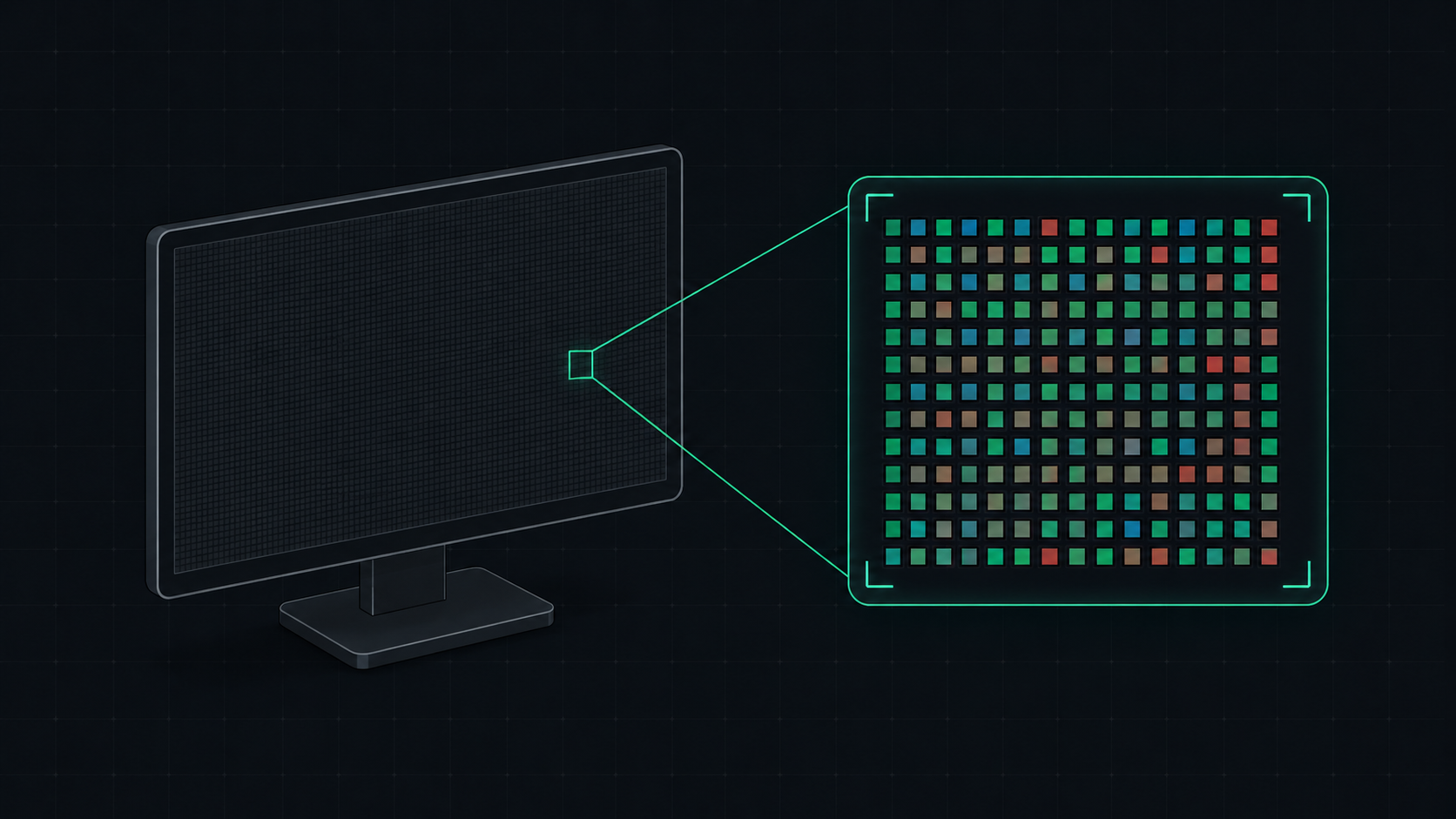
What is PPI? Pixels Per Inch Explained Simply
PPI (Pixels Per Inch) measures how many pixels are packed into one inch of a display screen. Learn what PPI means, how it affects image quality, and what a good PPI is for monitors, phones, and TVs.
 5 min read
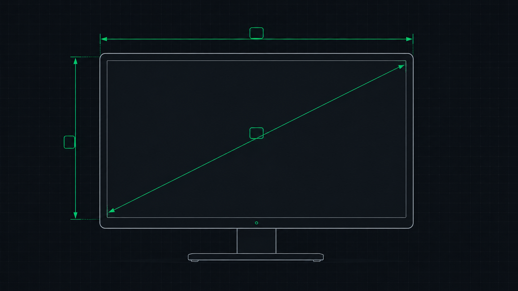
PPI Calculator: How to Find Your Monitor's Pixel Density
Learn how to use a PPI calculator to find your monitor's pixels per inch, understand what the number means, and compare pixel density across popular monitors, phones, and TVs.