Check Window Size
See the exact size of your web browser right now. Resizing this window will instantly update the dimensions in real-time.
The code boundary used by web designers to switch between phone, tablet, and desktop layouts.
The total space your browser window occupies on the screen, including tabs and scrollbars.
Shows if the screen content has been zoomed in or out.
What percentage of your screen width this browser window is currently using.
| Breakpoint Name | Viewport Width |
|---|---|
| Mobile / Default | < 640px |
| Small (SM) | ≥ 640px |
| Medium (MD) | ≥ 768px |
| Large (LG) | ≥ 1024px |
| Extra Large (XL) | ≥ 1280px |
| 2X Large (2XL) | ≥ 1536px |
What is Browser Viewport Size?
A browser viewport size is the visible rectangular viewing area of a web page currently rendered within a browser window, excluding toolbars, tabs, and scrollbars. It is measured in CSS pixels and dynamically controls responsive web breakpoints and fluid layouts.
What is a Browser Viewport?
The browser viewport is the visible area of a web page on a display device. It determines how CSS layouts and media queries adapt to different screen sizes, measured in logical CSS pixels rather than physical hardware pixels.
- Responsive Design: Viewport dimensions are essential for mobile-first web development.
- Dynamic Sizing: Unlike fixed screen resolution, viewport size changes when you resize your browser window.
- Zoom Impact: Adjusting browser zoom changes the number of logical pixels that fit into the viewport.
Frequently Asked Questions
Understand how browser zoom, media queries, and responsive grid layouts adapt to your window.
What is the difference between viewport size and screen resolution?
Screen resolution represents the fixed total physical hardware pixels of your display monitor (e.g., 1920×1080 or 3840×2160). Viewport size is the dynamic visible content area within your web browser window measured in logical CSS pixels (e.g., 1440×900), which scales when you resize the browser window, zoom in or out, or change OS display scaling.
What is a browser viewport?
The browser viewport is the visible area of a web page on a display device. It determines how CSS layouts and media queries adapt to different screen sizes, measured in logical CSS pixels rather than physical hardware pixels.
Why does my viewport size change when I zoom in?
When you zoom in, the browser increases the scale of logical CSS pixels. As a result, fewer logical pixels fit inside the browser window, causing the reported viewport width and height to decrease.
How does viewport size relate to responsive design?
Responsive design uses CSS Media Queries that inspect the viewport size to trigger layout changes (breakpoints). Modern frameworks like Tailwind target breakpoints starting at 640px (sm) up to 1536px (2xl) to adapt layouts for mobile and desktop screens.
What is the standard viewport size for mobile devices?
While it varies, the most common mobile viewport widths are 360px to 430px. For example, modern iPhones typically report a viewport width between 390px and 430px, while older or smaller Android devices often use 360px.
How does a viewport checker online work?
A viewport checker online, like our tool above, runs a viewport check by reading the inner dimensions of your browser window using Javascript. It dynamically updates as you resize the window.
How do I change viewport size in Chrome?
To change viewport size in Viewport Chrome or other browsers, you can either resize the browser window manually by dragging the edges, or use the browser's Developer Tools (F12) to simulate specific mobile device viewports.
Recommended Technical Guides
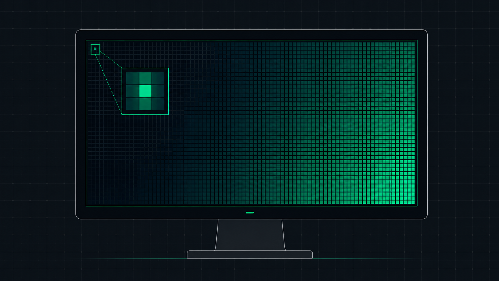 5 min read
What is Screen Resolution? A Plain-English Guide
Screen resolution is the number of pixels displayed on your screen horizontally and vertically. Learn what resolution means, the difference between HD, Full HD, QHD, and 4K, and how to check and change your display resolution.
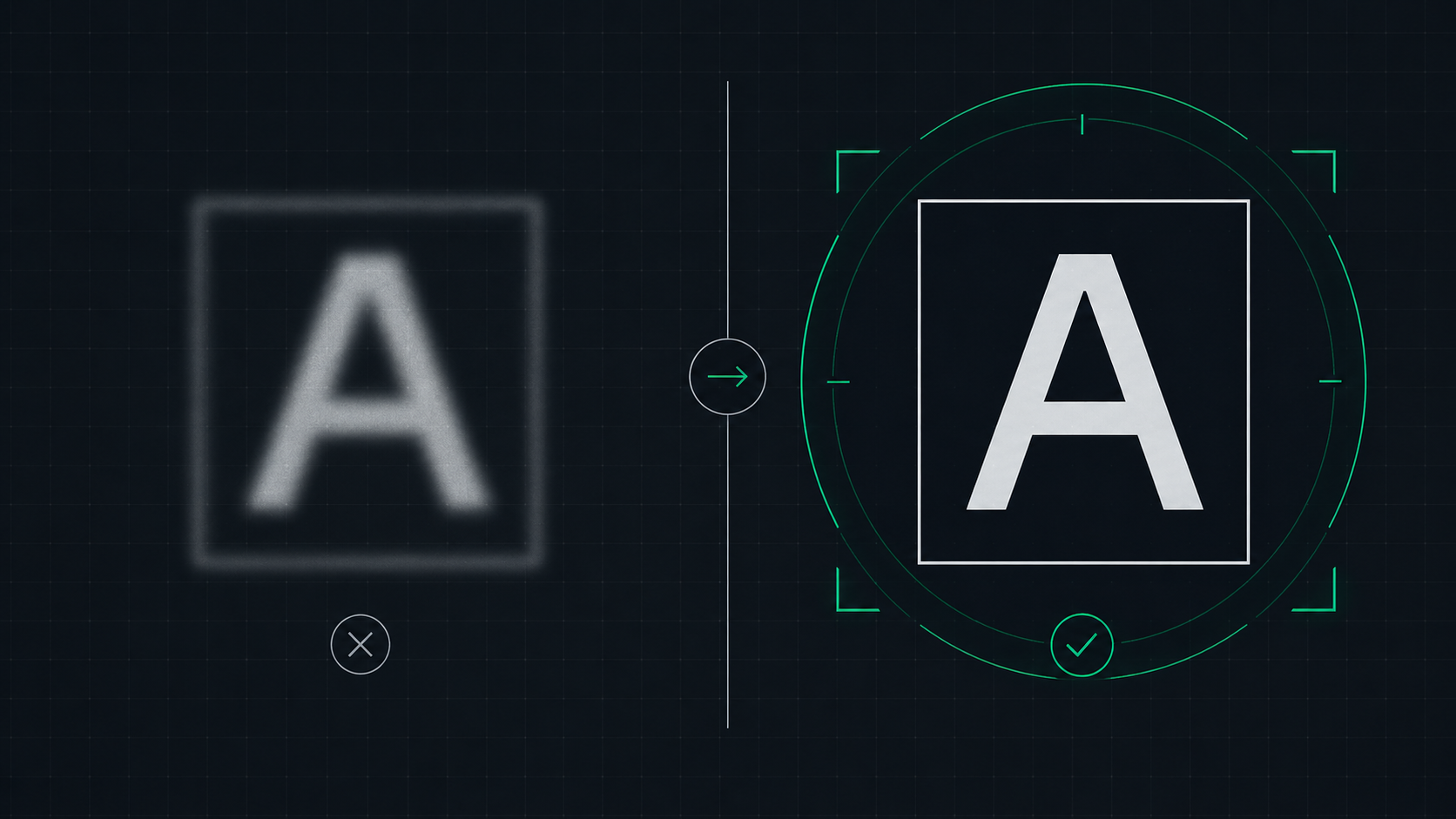 6 min read
How to Fix a Blurry Screen on Windows and Mac (2026 Guide)
Step-by-step guide to fixing blurry text and blurry displays on Windows 11, Windows 10, and macOS. Fix display scaling issues, ClearType settings, and external monitor blurriness caused by incorrect resolution or HiDPI settings.
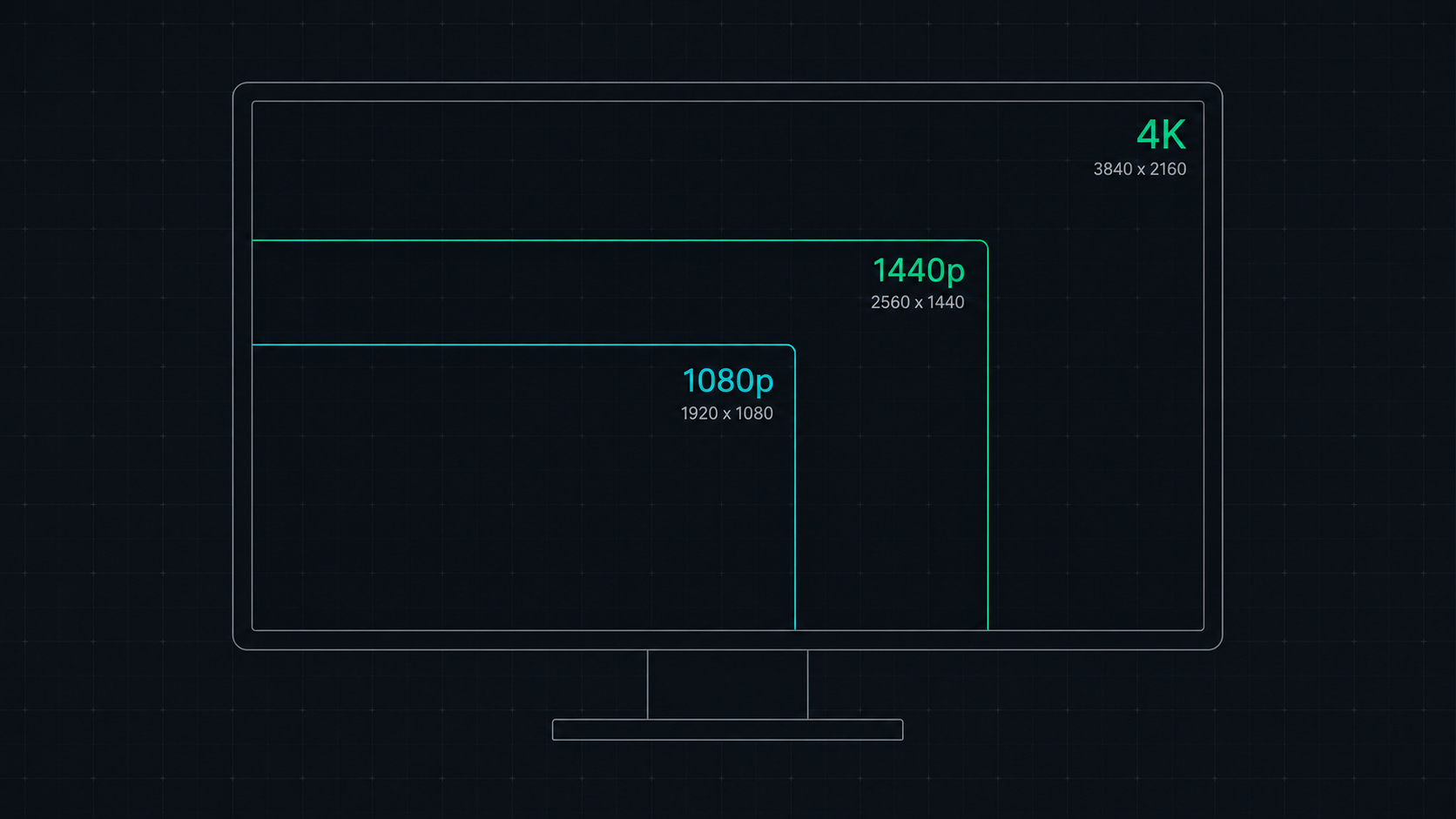 8 min read
1080p vs 1440p vs 4K: Which Resolution Is Right For You in 2026?
Comprehensive comparison of 1080p, 1440p, and 4K resolutions for gaming, work, and creative use. Find out which screen resolution is worth it in 2026 based on your monitor size, GPU, and viewing distance.